
A Professional Digital Identity

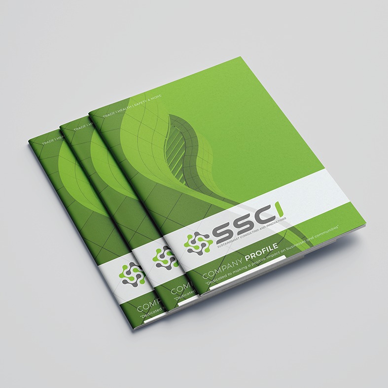
SustainSmart Consulting and Innovations (SSCI) is a South African consultancy specialising in management systems implementation, business development, compliance, and conformity assessment support across areas including trade, health, safety, environmental impact, and business sustainability.
Mosebo Studio developed a professional digital presence designed to communicate SSCI's expertise, credibility, and consultative approach. The website was structured to clearly introduce the organisation, communicate its vision and values, and provide visitors with an accessible overview of its specialist consulting services.
The digital experience places emphasis on SSCI’s core areas of expertise, including management system implementation, gap analysis, documentation development, and internal audits. Clear service-focused sections help prospective clients understand how SSCI supports organisations in meeting applicable standards, achieving certification, and maintaining ongoing compliance.
The website also reinforces the company’s values of excellence, innovation, collaboration, integrity, and sustainability, creating a cohesive brand experience that aligns its professional expertise with its broader business vision.
The result is a clean and professional digital platform that positions SSCI as a knowledgeable consulting partner while making its services, capabilities, and contact information easy for prospective clients to explore.




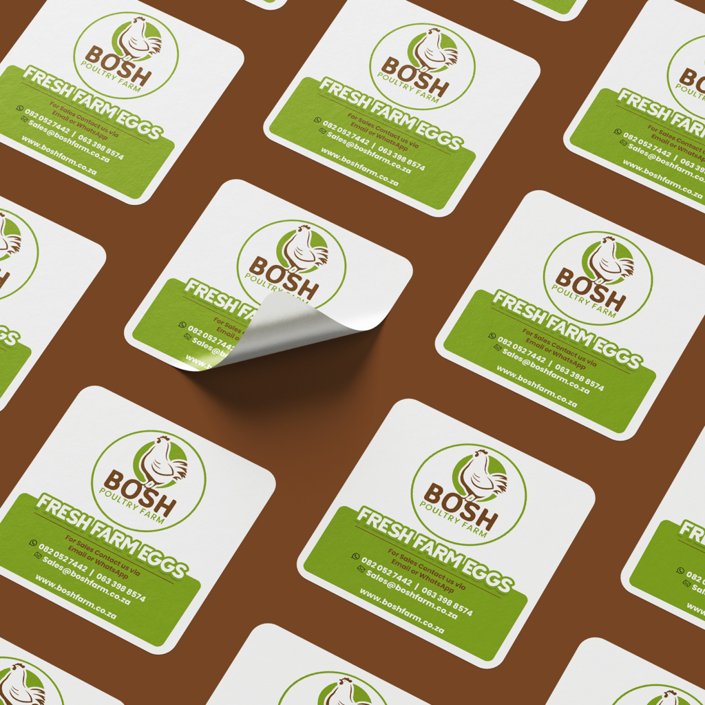
Bosh Farm is a South African poultry and egg brand focused on providing fresh, farm-raised eggs to customers through a range of sizes and convenient bulk purchasing options.
Mosebo Studio developed a digital presence designed to communicate the freshness, accessibility, and reliability of the Bosh Farm brand. The visual direction focuses on presenting the farm and its products in a clear and approachable way, making it easy for customers to discover the available egg ranges, view pricing, and place orders.
The website was structured around the brand’s core offering, with dedicated product information and clear calls to action encouraging customers to place an order or make an enquiry. The inclusion of different egg sizes and bulk purchasing options also allows Bosh Farm to communicate its offering to both everyday customers and larger-volume buyers.
The result is a straightforward and functional digital experience that gives Bosh Farm a professional online presence while keeping the focus firmly on its core product: fresh, farm-raised eggs delivered with simplicity and convenience.








Exceptional Tech Academy is a skills development and training organisation focused on equipping women and youth with practical, career-ready skills through hands-on training, mentorship, and access to essential resources. Its training model spans areas including Baking & Catering, Makeup Artistry, IT, and Engineering & Technology, creating opportunities for learners to develop practical expertise and pursue career or entrepreneurial pathways.
Mosebo Studio developed the digital experience to communicate the academy's purpose in a clear, accessible, and engaging way. The website was structured around the academy's different Training Hubs, allowing visitors to explore programmes, understand the practical value of the training, and connect with opportunities to participate or provide sponsorship support.
The design direction balances professionalism, accessibility, and a sense of opportunity, reflecting Exceptional Tech Academy’s focus on practical education and community empowerment. Dedicated sections for programmes, featured training, testimonials, academy news, and sponsorship help communicate both the organisation’s impact and its wider vision.
The result is a purposeful digital presence that positions Exceptional Tech Academy as a platform for skills development, personal growth, entrepreneurship, and opportunity, while providing a clear foundation for the academy’s expanding range of training programmes.



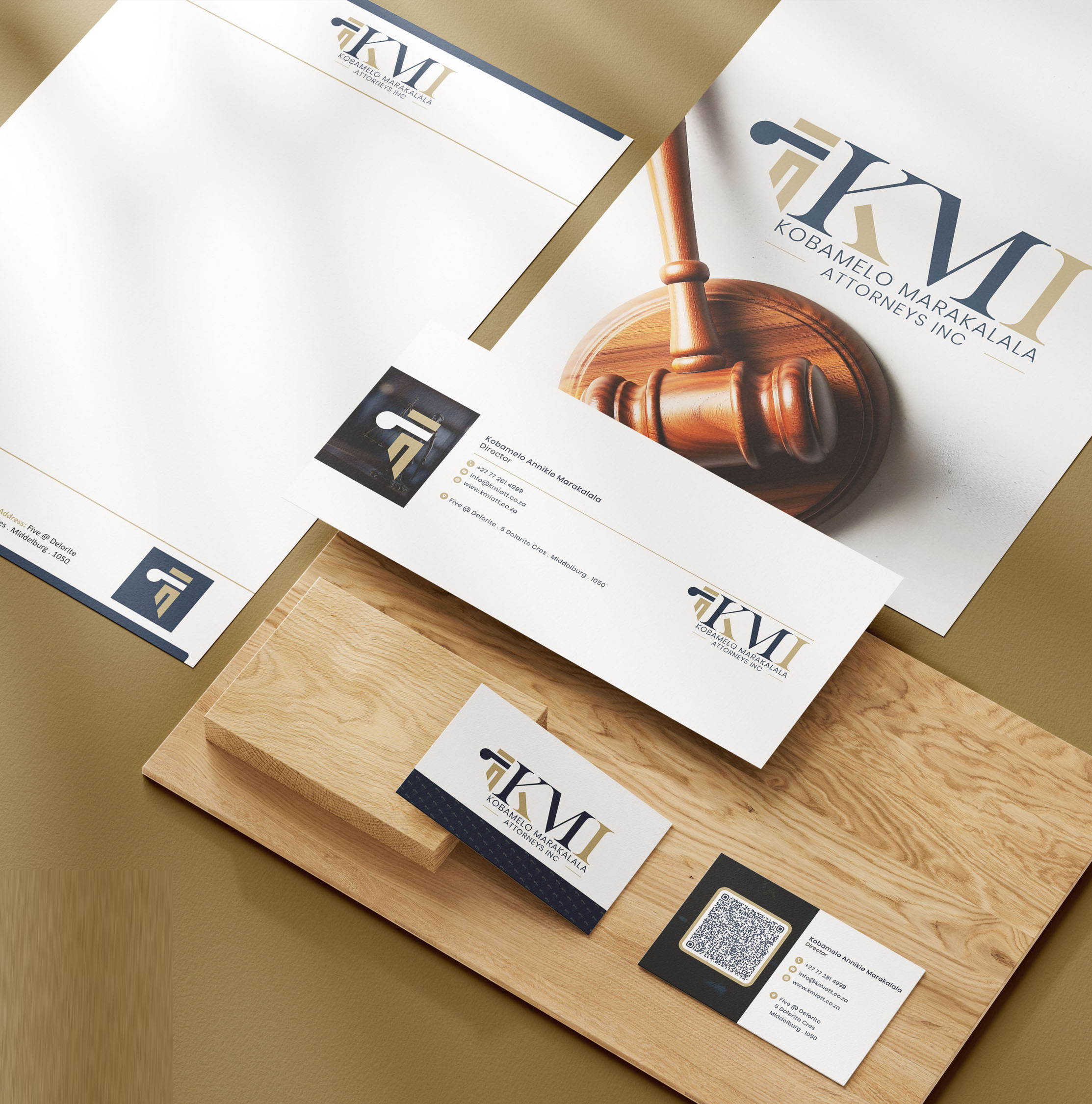

KMI Attorneys is a legal brand identity designed to communicate professionalism, confidence, and sophistication through a refined and contemporary visual language.
Mosebo Studio developed the visual identity around a distinctive typographic monogram, combining the initials KMI with a sophisticated navy and gold colour palette. The result is a professional identity that reflects the credibility and established nature of a modern legal practice.
For a legal practice, visual identity plays an important role in establishing trust and communicating professionalism.
KMI Attorneys required an identity that would present the firm as credible and established while maintaining a contemporary and distinctive appearance.
The identity needed to balance:
The opportunity was to create a brand identity that would feel confident and established while remaining visually distinctive.
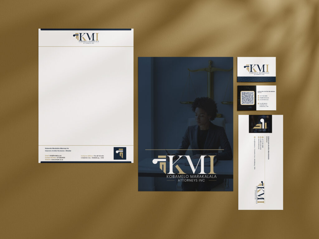
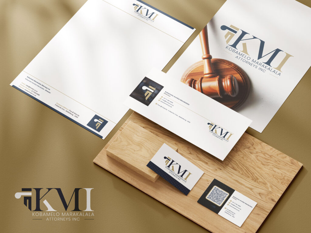
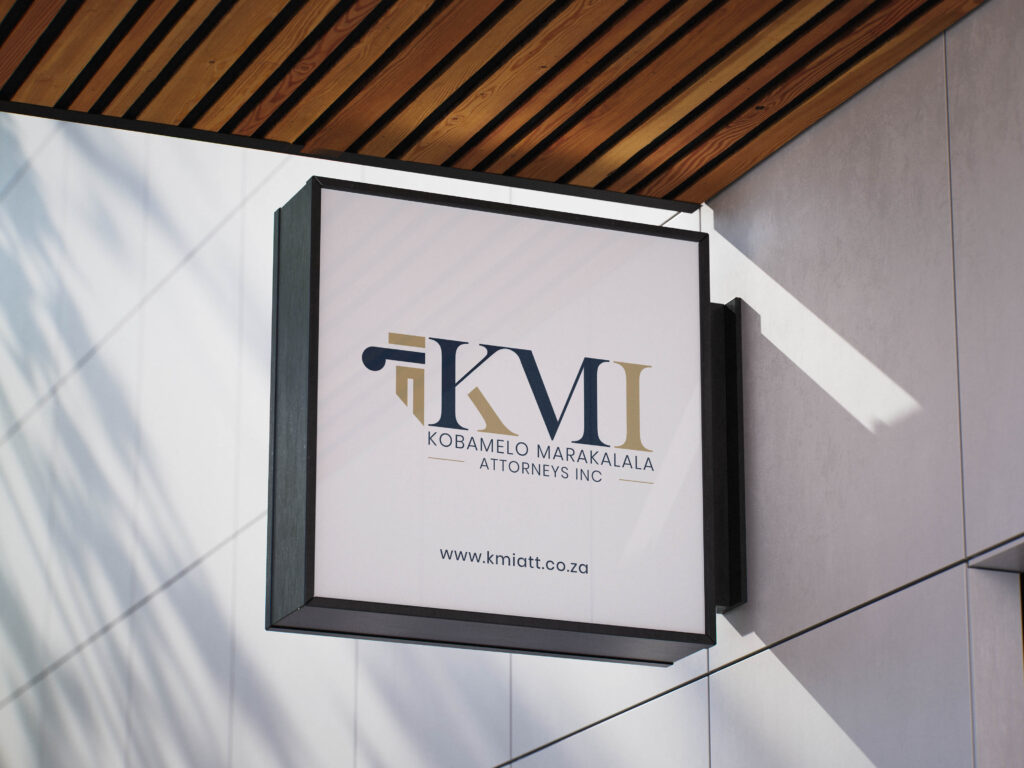


The creative direction for KMI Attorneys focuses on simplicity, structure, and professional sophistication.
The identity combines a custom-looking monogram with refined typography and a restrained colour palette to create a visual language that feels established and contemporary.
The structured monogram and formal typography establish a strong visual presence suited to a professional legal practice.
The identity uses a focused combination of typography, colour, and spacing to create a clean and sophisticated appearance without unnecessary visual elements.
The KMI monogram provides the brand with a recognisable visual signature that can be used independently across different applications.
The KMI Attorneys identity is built around a distinctive KMI monogram, giving the brand a strong and memorable visual mark.
The monogram combines the initials of the practice into a structured typographic form, creating an identity that feels both professional and distinctive.
The supporting typography clearly presents Kobamelo Marakalala Attorneys Inc, providing context and reinforcing the formal nature of the practice.
The typography system creates a balance between the visual impact of the monogram and the clarity required for a professional legal brand.
This allows the identity to maintain a sophisticated appearance across signage, stationery, digital platforms, and other corporate applications.
The KMI Attorneys colour palette combines deep navy with warm gold accents against a clean neutral background.
The navy tone creates a sense of professionalism, structure, and confidence while providing a strong foundation for the identity.
Gold introduces a refined and premium visual element, adding distinction to the monogram without overwhelming the overall design.
The neutral background creates contrast and allows the logo to remain clear, prominent, and highly legible.
The combination of navy, gold, and neutral tones creates a polished visual identity that feels appropriate for a contemporary legal practice.
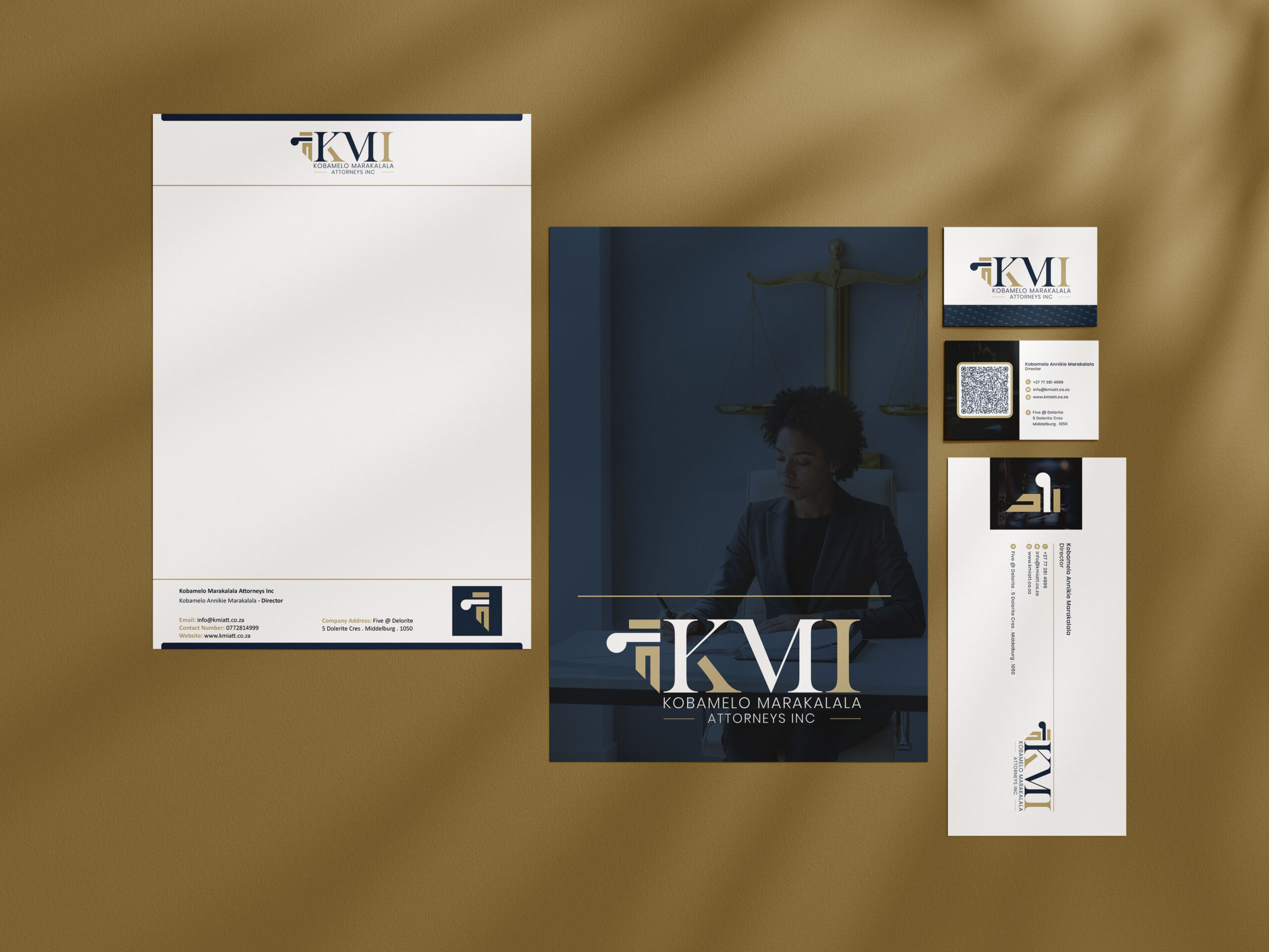
The KMI Attorneys identity is designed to extend beyond the primary logo into a complete corporate visual system.
The combination of the monogram, typography, and colour palette provides a consistent foundation for professional communication across multiple brand touchpoints.
The identity can be applied across:
The result is a cohesive visual system that allows the practice to maintain consistency across both physical and digital environments.
The KMI Attorneys visual identity can extend across a wide range of professional and customer-facing applications.
The identity can be applied to exterior building signage, reception areas, office doors, directional signage, and other environmental branding.
The logo and visual system can be adapted across business cards, letterheads, envelopes, legal documents, folders, and other corporate stationery.
The identity provides a consistent foundation for the firm's website, email signatures, social media profiles, digital presentations, and online communications.
The visual language can be applied to brochures, company profiles, presentations, advertisements, and professional promotional materials.
The identity creates consistency across client-facing documents and communications, helping establish a unified professional presence.
At Mosebo Studio, we believe a professional identity should communicate more than a company's name. It should establish recognition, create confidence, and provide a consistent visual foundation for every customer interaction.
For KMI Attorneys, the design approach focused on four principles:
Authority: A strong visual identity that reflects the professional nature of the legal practice.
Clarity: Clear typography and structure that ensure the brand remains easy to recognise and read.
Sophistication: A refined colour palette and restrained visual language that create a polished appearance.
Consistency: A flexible identity system that can be applied across physical, digital, and corporate touchpoints.
The KMI Attorneys identity combines a distinctive monogram, refined typography, and a sophisticated navy and gold colour palette to create a professional and recognisable brand presence.
The finished identity communicates:
The result is a visual identity that provides KMI Attorneys with a strong foundation for building a consistent and recognisable legal brand.
For professional service businesses such as law firms, branding is an important part of how clients experience and perceive the practice.
A considered visual identity can help a legal practice:
KMI Attorneys demonstrates how considered typography, colour, monogram design, and corporate applications can come together to create a professional brand experience.
Your brand is part of how clients experience your business.
Whether you are launching a new practice, refreshing an existing identity, or developing a complete corporate brand system, Mosebo Studio creates strategic and distinctive design solutions that help businesses communicate with clarity and confidence.
Our services include:
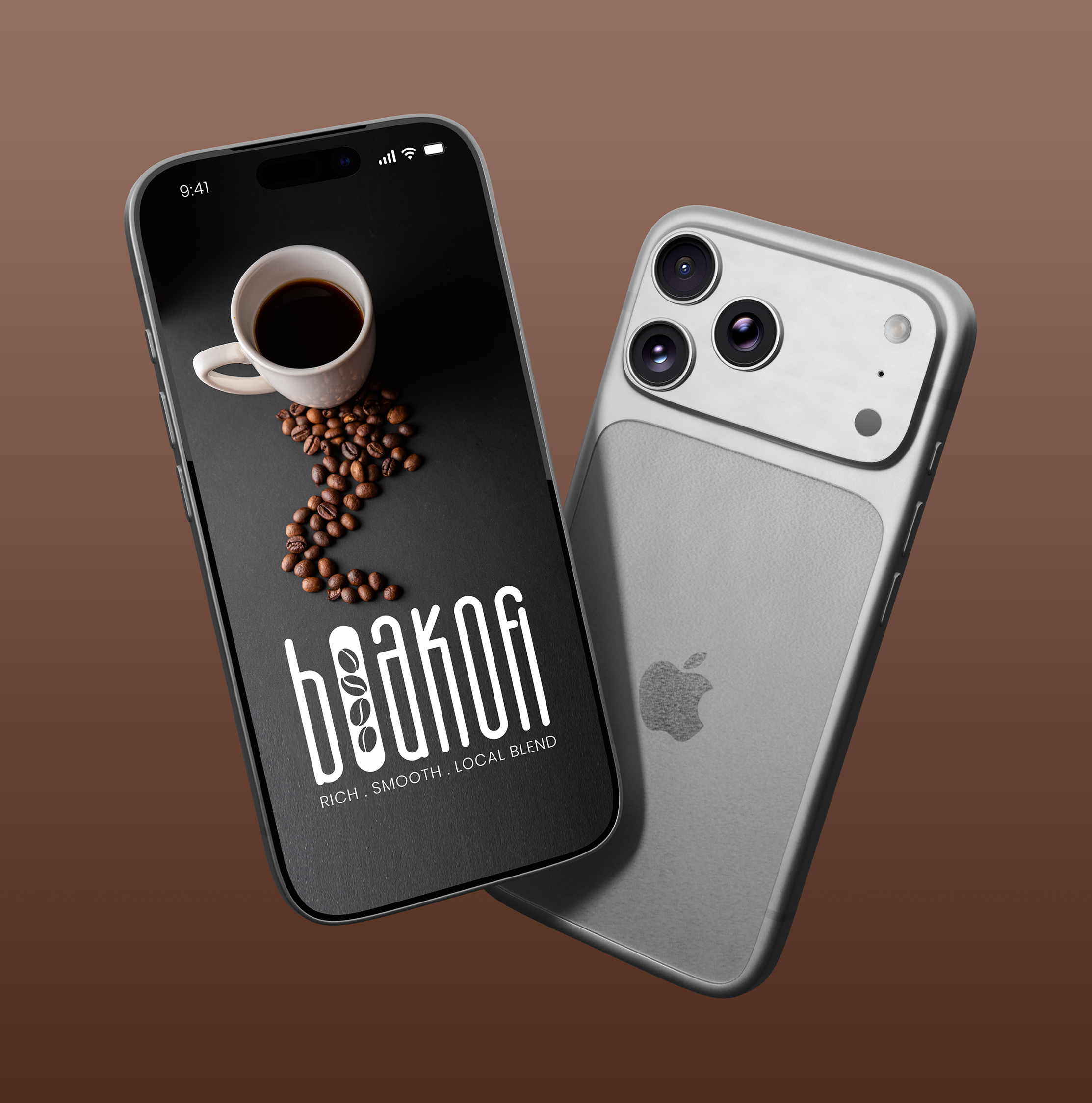

BoaKofi Blends is a coffee brand identity designed to bring together the warmth of coffee culture, expressive illustration, and a distinctive handcrafted visual language.
Mosebo Studio developed the visual identity and packaging direction around a bold typographic treatment, warm earthy tones, and playful coffee-inspired illustrations. The result is a brand presence that feels authentic, approachable, and memorable.
Coffee is a highly visual product category, with packaging playing an important role in attracting attention and communicating the character of the brand.
For BoaKofi Blends, the creative direction needed to establish a strong identity while reflecting the warmth, energy, and craft associated with coffee.
The identity needed to balance:
The opportunity was to create packaging that felt expressive and engaging while maintaining a clear connection to the coffee experience
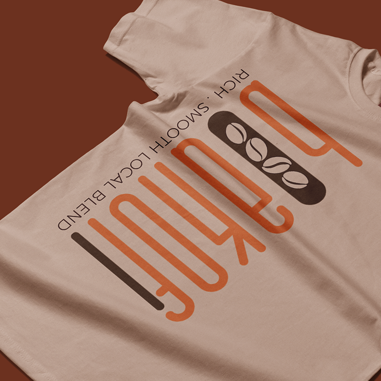


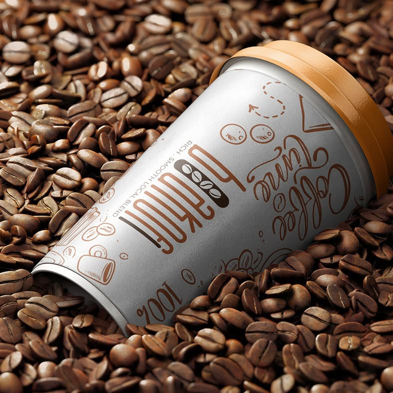
The creative direction for BoaKofi Blends draws inspiration from coffee culture, roasted beans, handcrafted preparation, and the everyday rituals surrounding a good cup of coffee.
The visual language combines bold typography with illustrated coffee elements to create a personality that feels both contemporary and artisanal.
The logo was developed around three central ideas:
Coffee-inspired illustrations and graphic details create an immediate connection to the product and the experience surrounding it.
The expressive lettering and illustrated elements introduce an organic, hand-drawn quality that gives the brand personality and warmth.
The packaging uses a focused visual approach, allowing the brand name, illustrations, and key messaging to work together without creating unnecessary visual complexity.
The BoaKofi Blends identity is built around expressive typography that gives the brand a strong visual signature.
The lettering has a handcrafted quality, helping the brand feel personal and distinctive rather than overly corporate.
The supporting typography introduces structure and improves readability, creating a balance between the expressive elements and the practical information required on product packaging.
This combination allows the identity to feel creative while remaining functional across different brand applications.
Illustration plays an important role in the BoaKofi Blends visual language.
Coffee cups, beans, brewing elements, and playful graphic details help communicate the product category while adding personality to the packaging.
These elements create a visual texture that supports the brand story and gives the packaging a more distinctive appearance.
The illustrations can also be adapted into supporting brand assets for social media, promotional materials, merchandise, and other customer touchpoints.
The BoaKofi Blends colour direction is inspired by the natural tones associated with coffee.
Earthy browns connect the identity directly to roasted coffee beans and create a warm, familiar visual atmosphere.
The neutral packaging background provides space for the typography and illustrations to remain prominent while keeping the overall composition clean.
The combination of warm tones and neutral surfaces creates a grounded visual identity that reflects the character of the product.

The Afro Naturals logo uses a soft, nature-inspired colour direction.
The green tones in the leaf symbol reinforce the brand’s connection to nature, plant life, and natural beauty.
Green is a familiar visual association for botanical and natural product categories, making it a relevant choice for the brand’s identity.
The pale, warm neutral background creates a calm and understated foundation for the logo. It allows the green botanical symbol and grey wordmark to remain visually prominent without relying on a strong or distracting background colour.
The grey wordmark provides a softer alternative to pure black. This helps maintain the logo’s elegant, approachable character and complements the natural colour palette.
The BoaKofi Blends identity can extend beyond the primary packaging into a wider range of customer-facing applications.
The visual system can be adapted across coffee cups, bags, boxes, labels, and other coffee-related packaging.
The typography, illustrations, and graphic elements provide a strong foundation for branded social media content, product announcements, promotions, and educational posts.
The identity can be applied to flyers, posters, menus, promotional graphics, and digital advertising.
The distinctive graphic language can also translate into branded merchandise such as coffee cups, apparel, tote bags, and other promotional products.
The visual identity can support a consistent website and e-commerce experience, connecting the digital brand presence with the physical packaging.
At Mosebo Studio, we believe packaging should do more than present a product. It should create recognition, communicate personality, and give customers a reason to engage with the brand.
For BoaKofi Blends, the design approach focused on four principles:
Character: A distinctive visual language that gives the brand personality.
Clarity: A clear hierarchy that keeps the product and brand easy to recognise.
Consistency: A cohesive system that can be applied across multiple touchpoints.
Adaptability: Flexible graphic elements that can evolve with the product range.
The BoaKofi Blends identity combines expressive typography, coffee-inspired illustration, and warm earthy tones to create a distinctive and engaging brand presence.
The finished identity communicates:
The result is a visual foundation that can grow across packaging, digital platforms, marketing materials, and future product extensions.
For consumer products, packaging is often one of the first interactions a customer has with a brand.
Effective packaging can help a business:
BoaKofi Blends demonstrates how thoughtful typography, illustration, and packaging design can turn a simple product into a more recognisable brand experience.
Your packaging is part of your brand story.
Whether you are launching a new product, developing a packaging system, or building a complete visual identity, Mosebo Studio creates strategic and distinctive design solutions that help brands communicate with clarity.
Our services include:

Brand Identity Design | Logo Design | Visual Identity
Afro Naturals is a natural beauty brand identity that brings together botanical inspiration, organic forms, and elegant typography. Designed by Mosebo Studio, the visual identity reflects a brand direction centred around natural beauty, simplicity, and a connection to nature.
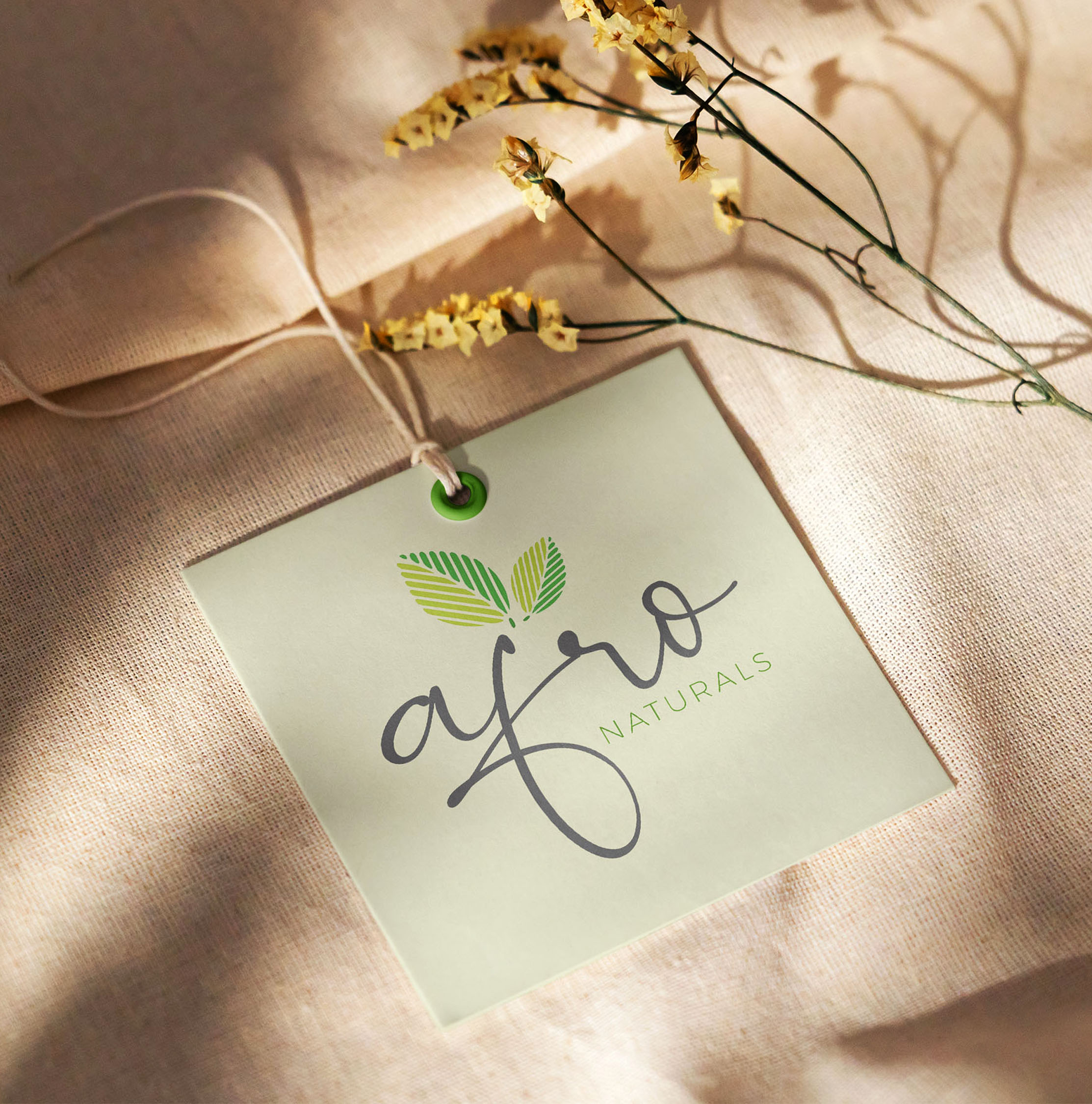
The logo combines a flowing, expressive wordmark with a distinctive botanical symbol and a refined “NATURALS” descriptor. The result is a visual identity that feels graceful, contemporary, and well suited to a natural beauty and personal care brand.
This project demonstrates how thoughtful logo design and a considered visual identity can help a brand communicate its essence before a customer even reads its name.
Natural beauty is a competitive space, with brands needing to communicate authenticity, quality, and a clear point of difference through their visual presentation.
For Afro Naturals, the creative direction needed to support a natural and botanical brand personality while maintaining a polished, memorable appearance.
The identity needed to balance:
The design opportunity was to create an identity that felt organic without appearing overly complicated, and refined without losing its connection to nature.


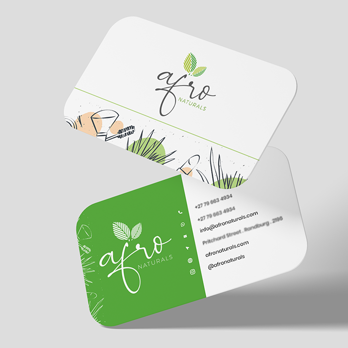


The creative direction for Afro Naturals draws inspiration from the beauty of plants, organic growth, and the relationship between nature and personal care.
The logo was developed around three central ideas:
The botanical symbol introduces an immediate connection to nature. Its leaf forms suggest growth, freshness, and plant-based inspiration.
The flowing script lettering gives the brand a soft, expressive, and graceful personality. Its hand-drawn quality creates a sense of warmth and individuality.
The restrained colour palette and clean supporting typography help the identity feel contemporary. The design has enough character to be memorable while remaining suitable for a range of brand applications.
The Afro Naturals logo is the primary visual signature of the brand.
It features a flowing script wordmark, a botanical leaf symbol, and a clean uppercase descriptor. Each element contributes to the overall personality of the identity.
The expressive script lettering gives Afro Naturals a distinctive and feminine-inspired visual character. The flowing strokes create movement and softness, helping the brand feel personal and approachable.
The wordmark is designed to stand out from more conventional serif or sans-serif beauty logos, giving the brand a more organic and artistic presence.
The leaf symbol is the defining graphic element of the identity.
Its paired leaf forms are built from elongated, repeated shapes that create a sense of natural rhythm. The upward growth of the leaves suggests vitality, renewal, and a connection to botanical ingredients.
Beyond its decorative role, the symbol provides an identifiable visual asset that can be adapted for packaging, social media, labels, and other brand touchpoints.
The uppercase descriptor provides balance beneath the expressive wordmark.
Its clean, widely spaced lettering introduces a more structured and contemporary quality, helping communicate the brand category while supporting the softer script lettering above it.
This contrast between expressive script and minimal typography creates a balanced, premium-inspired identity.
The Afro Naturals logo uses a soft, nature-inspired colour direction.
The green tones in the leaf symbol reinforce the brand’s connection to nature, plant life, and natural beauty.
Green is a familiar visual association for botanical and natural product categories, making it a relevant choice for the brand’s identity.
The pale, warm neutral background creates a calm and understated foundation for the logo. It allows the green botanical symbol and grey wordmark to remain visually prominent without relying on a strong or distracting background colour.
The grey wordmark provides a softer alternative to pure black. This helps maintain the logo’s elegant, approachable character and complements the natural colour palette.
A strong visual identity should work beyond the logo itself. Afro Naturals’ identity can be adapted across a variety of customer touchpoints.
The botanical symbol and wordmark can be applied to skincare jars, bottles, tubes, labels, and product boxes.
The simple colour palette allows for clean packaging compositions that maintain a natural and elegant appearance.
The identity can be used across Instagram, Facebook, and other digital platforms to create a recognisable brand presence.
Possible applications include:
The logo can be extended to business cards, letterheads, invoices, and other branded business materials.
The identity provides a foundation for flyers, brochures, promotional banners, and digital advertising assets.
The logo and colour palette can support a consistent online shopping experience, helping connect the brand’s website design with its packaging and social media presence.
At Mosebo Studio, we believe that a strong brand identity is more than an attractive logo. It is a visual system that helps communicate who a brand is, what it represents, and how it wants to be remembered.
For Afro Naturals, the design approach centres around:
Clarity: A recognisable logo that communicates the brand name and category.
Consistency: A cohesive visual direction that can be applied across multiple platforms.
Character: Expressive lettering and botanical graphics that give the brand a distinctive personality.
Adaptability: A logo and visual system that can support future packaging, marketing, and digital applications.
The goal is to create an identity that feels relevant to the natural beauty space while giving the brand a strong foundation for future growth.
The Afro Naturals identity brings together expressive typography, botanical inspiration, and a restrained colour palette to create a distinctive natural beauty brand aesthetic.
The finished logo communicates:
The identity establishes a visual foundation that can be extended into a complete brand system, from packaging and marketing materials to digital experiences.
In the natural beauty industry, visual presentation plays an important role in how customers recognise and understand a brand.
A well-designed identity can help a business:
Afro Naturals demonstrates how a thoughtful combination of typography, colour, and botanical imagery can create a memorable visual direction.
Building a brand starts with a clear idea and a visual identity that brings it to life.
Whether you are launching a natural beauty brand, refreshing an existing business, or developing a complete packaging and marketing system, Mosebo Studio can help you create a brand identity that reflects your vision.
Our branding services include:
Let’s create a brand that stands out.
Designed with Purpose. Built for Impact.
Branding · Web Design · Digital Marketing · Brand Experience
Mosebo Studio © 2026 | All Rights Reserved. Inspired by Proverbs 16:3
Terms & Conditions | Privacy Policy

