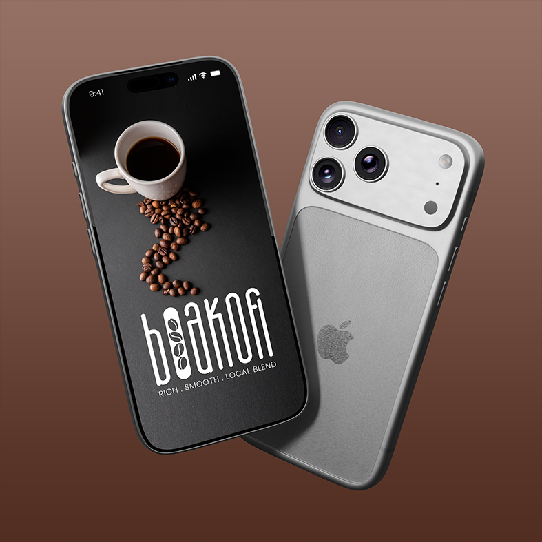
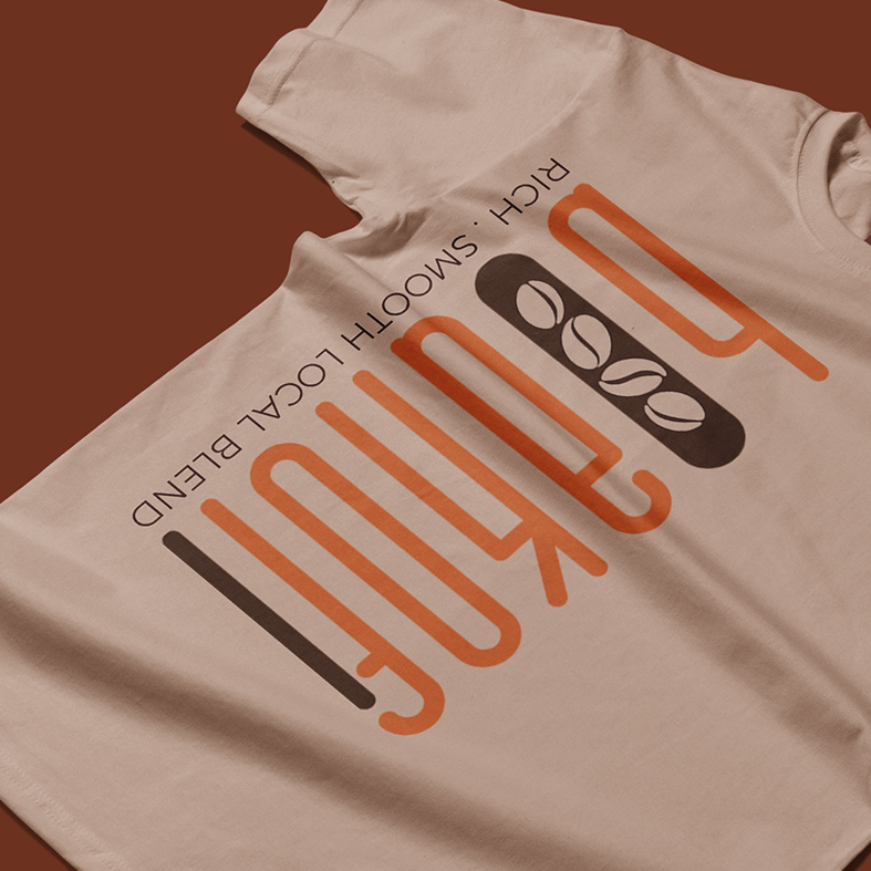
Boakofi is a premium coffee brand crafted around the belief that exceptional coffee is more than a beverage, it’s an experience. Inspired by rich local coffee culture and refined through modern craftsmanship, the brand delivers smooth, distinctive blends that bring people together over every cup.
Designed to embody authenticity, sophistication, and everyday luxury, Boakofi celebrates the ritual of great coffee while honouring the heritage behind every bean.
The Boakofi brand identity was created to establish a distinctive and premium presence within the coffee market. Inspired by the craftsmanship of locally roasted coffee and the culture surrounding exceptional coffee experiences, the identity blends contemporary minimalism with authentic chara
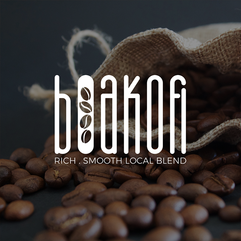
At the heart of the visual identity is a custom logotype featuring an integrated coffee bean icon, symbolising quality, craftsmanship, and the brand’s passion for every blend. Clean typography, refined proportions, and a rich, earthy colour palette work together to communicate sophistication while remaining warm and approachable.
Espresso Black – #1A1414
Signature Roast – #B85932
Pure White – #FFFFFF
Develop a contemporary coffee brand that stands confidently within the premium market while remaining approachable and deeply connected to local identity. The visual identity needed to communicate quality, craftsmanship, and warmth across retail packaging, café environments, and digital platforms.
The creative direction centred around minimalism with character. Inspired by the form of coffee beans and clean architectural typography, the identity balances modern elegance with handcrafted authenticity.
The custom logotype transforms the coffee bean into a distinctive visual feature, creating an instantly recognisable identity that reflects both the product and the story behind the brand.
The Boakofi identity was designed to evoke confidence through simplicity. Tall, refined letterforms communicate elegance, while the integrated coffee bean motif reinforces the brand’s commitment to quality and craftsmanship.
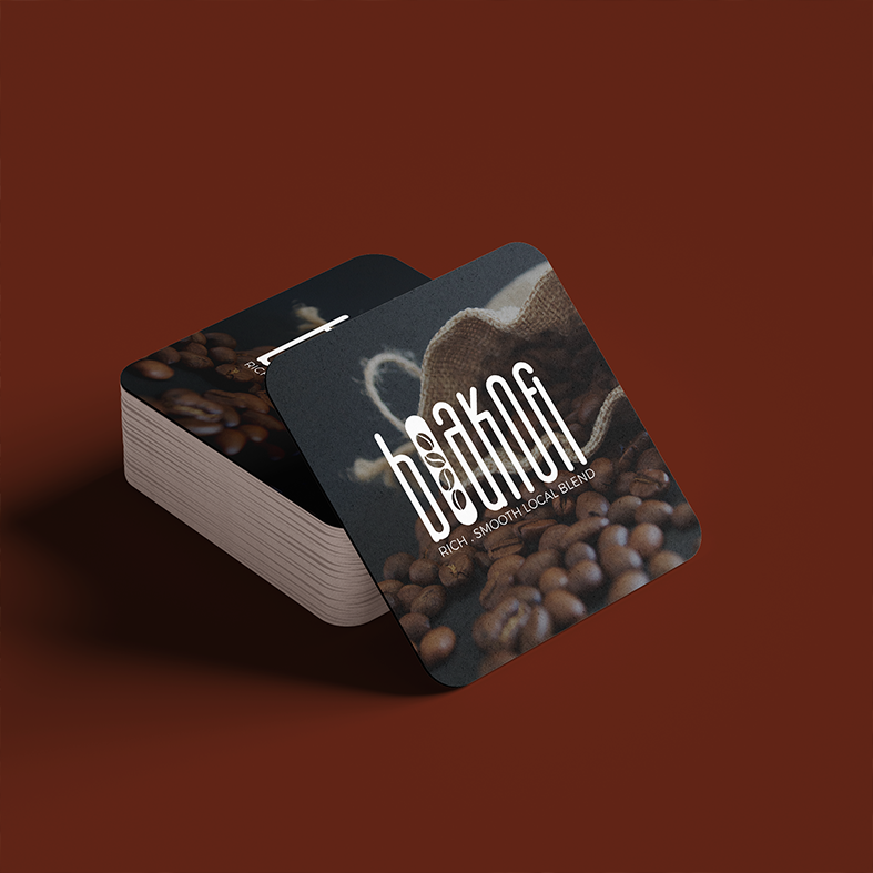
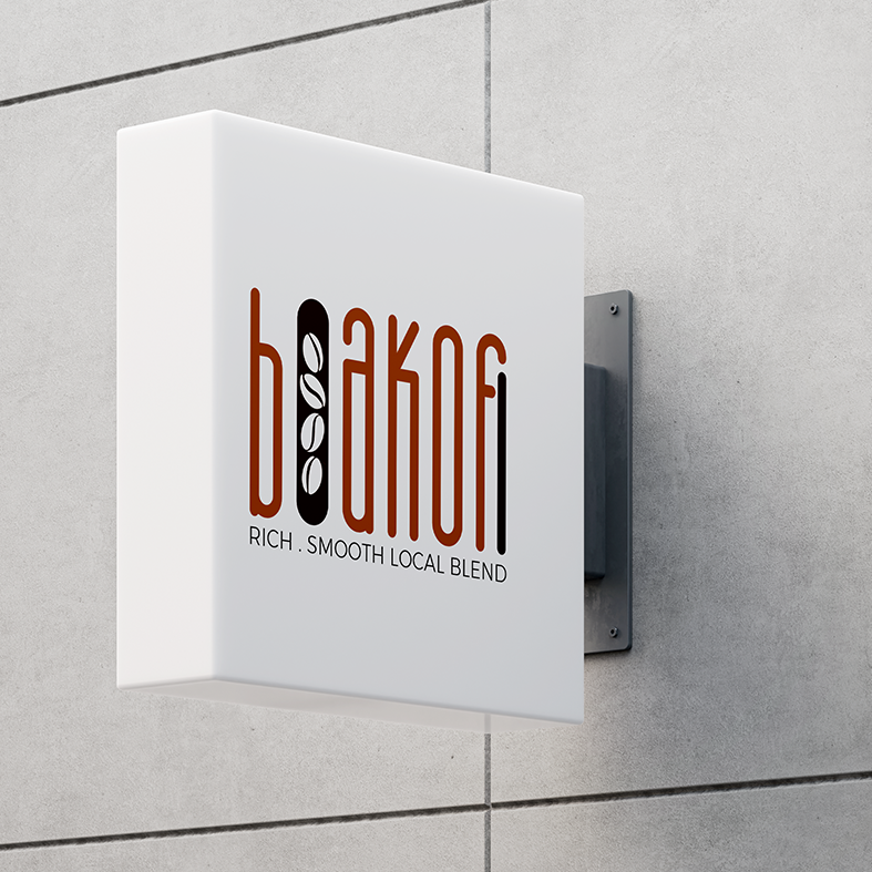
A restrained visual language allows the product to become the hero, ensuring the identity remains timeless across packaging, signage, merchandise, and digital experiences.

A bespoke-inspired condensed type style forms the foundation of the visual identity. The elongated letterforms create a sophisticated, memorable silhouette while expressing refinement and confidence. Supporting typography remains clean and understated, allowing the brand to communicate with clarity across every touchpoint.
Boakofi was positioned as a premium coffee brand that blends modern design with authentic local character. The refined identity creates an immediate sense of quality while remaining welcoming and memorable. With a flexible visual system and timeless aesthetic, the brand is equipped to grow across retail, hospitality, and digital environments while delivering a consistent and elevated customer experience.
Afro Naturals is a premium beauty and personal care brand inspired by the power of nature. Combining botanical ingredients with modern beauty science, the brand offers high-quality skincare products that nourish, protect, and enhance natural beauty. Built on the values of quality, sustainability, and self-care, Afro Naturals empowers individuals to embrace their unique beauty with confidence.
Developed a premium brand identity for Afro Naturals, capturing the essence of natural beauty, wellness, and sustainability. The visual identity was designed to reflect elegance, authenticity, and trust while creating a strong foundation for future packaging, marketing, and digital brand experiences.
The identity is versatile across packaging, product labels, digital platforms, and marketing materials, providing a strong visual foundation that supports long-term brand recognition and growth.
Forest Green – #3F6B4F
Sage Green – #3F6B4F
Charcoal – #3F6B4F
Create a sophisticated visual identity that communicates natural beauty without relying on predictable organic aesthetics. The brand needed to appeal to a premium skincare audience while remaining approachable, memorable, and versatile across packaging and digital platforms.
The design direction focused on creating a refined balance between luxury and nature. Organic leaf elements were paired with elegant typography to symbolize growth, purity, and botanical excellence. A clean, minimal aesthetic ensures the brand feels contemporary while remaining timeless.
The logo combines flowing script typography with handcrafted botanical illustrations to create a distinctive signature mark. The visual language is soft yet sophisticated, reflecting the brand’s promise of quality skincare inspired by nature.
Every design element was intentionally selected to reinforce trust, wellness, and premium craftsmanship.
Elegant typography was selected to communicate confidence and refinement. The combination of expressive script and clean supporting typefaces creates a distinctive brand presence that feels luxurious without compromising readability.
The completed identity positions Afro Naturals as a premium beauty brand with a timeless visual language rooted in nature. The branding establishes a strong foundation for future product ranges, packaging, retail experiences, and digital marketing while creating a memorable and recognisable presence within the competitive beauty industry.
Whether you’re launching a new venture, elevating an established brand, or reimagining your digital presence, we’re here to help you create work that leaves a lasting impression.
Trusted by businesses across South Africa for Branding, Website Design & Digital Solutions.
Mosebo Studio © 2026 | All Rights Reserved. Powered by Creativity.